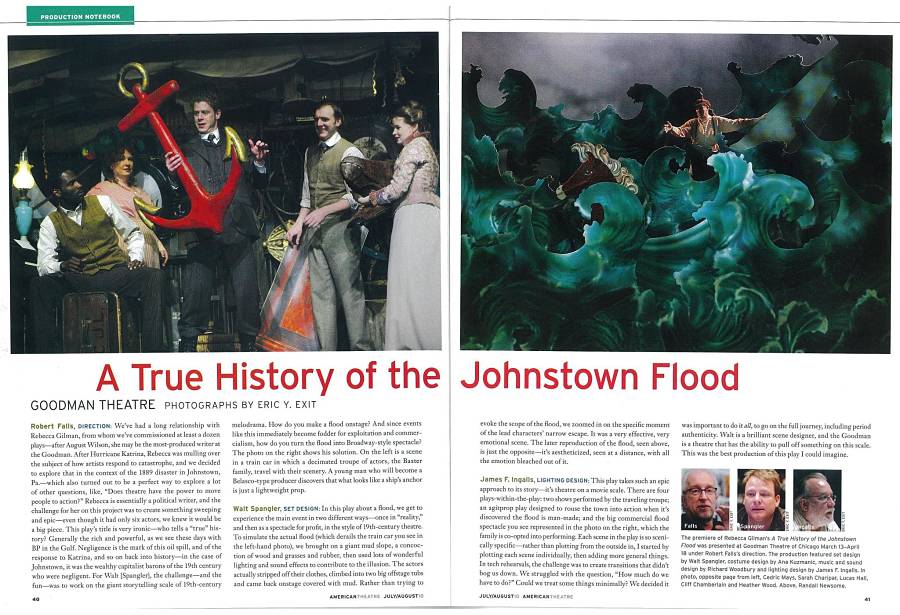
You may or may not have noticed a quiet transformation in American Theatre since late last year. For many years the feature Production Notebook graced our magazine with a two-page spread of striking photos, showcasing the design aspects of a recent-ish production, with a few quotes from the design team and typically the show’s director.
This beloved fixture had a few shortcomings, in my view. First, it privileged the work of visual designers (set, costume, and, less frequently, lighting), not to mention productions that had the good sense (or the budget) to take and provide us with beautiful photos—a show without them wouldn’t make the cut. But, of course, design is an integral and many-shaded thing; eye-catching is not its end-all, be-all. I worried that in throwing designers this monthly bone—admittedly, a gorgeous-looking bone—amid more wide-ranging stories about playwrights, directors, and actors, we were missing too much of the real story of how theatre is made in the U.S., plank by plank and cue by cue.

Our approach toward this deficit may sound counterintuitive, but hear me out. Production Notebook, as its name always promised, is now a long-form reported piece about the entire process behind a given show at a different resident theatre each month. While the focus is no longer narrowly trained on a show’s design, let alone just one aspect of its design, the length and depth of these new-style Production Notebooks allow reporters to follow a show through all its decisions, from dramaturgy to design, casting to set construction, tech week to ticketing. This “rehearsal to reviews” coverage can highlight different challenges and practices for all different kinds of shows at all different sorts of theatres, and I’d argue allows us to cover design, when it’s a central part of a production’s process, in more granular specificity than ever before.
In our first retooled Production Notebook last December, Barry Wisdom wrote about the scrappy efforts of Sacramento, Calif.’s smallish Capital Stage to create the apocalyptic worlds of Anne Washburn’s Mr. Burns, a post-electric play, and in January, associate editor Diep Tran filed a lively report on Sisters’ Follies: Between Two Worlds, a splashy history of New York City’s Abrons Arts Center from Basil Twist and his puppeteer posse. February’s issue saw Jeremy D. Goodwin following playwright Jeffrey Hatcher through his high-stakes adaptation of A Confederacy of Dunces at Boston’s Huntington Theatre, and in March, Aaron C. Thomas showed how Florida Studio Theatre used Butler, Richard Strand’s Civil War comedy, to open up discussions about race and history.
For April’s issue on Theatre for Young Audiences, Omaha, Neb., reporter Ashley Wegner covered the Rose Theater’s immersive, toddler-friendly staging of A Child’s Garden of Verses. This issue spotlights another youth-oriented production, in a report by Allison Considine on Salt Lake Acting Company’s sweeping multimedia adaptation of Climbing With Tigers, based on a book coauthored by an extraordinary youngster with brittle bone disease. It also happened to feature some eye-popping design work, on the evidence of the photos.
We’ve also got a new feature in the front of the magazine called Design Corner (it typically appears online here), in which we focus on one aspect of a show’s design, à la the old Production Notebook. And our next issue will contain what we hope to be the first of an annual spotlight on design and tech, with a Production Notebook that promises to be a design-heavy exploration of a form-breaking new American play. That’s all I can say for now, but trust, if you will, that we at American Theatre have our eyes and ears—all our senses, let’s say—attuned with renewed attention to the struggles and successes, big and small, of American stagecraft as it’s practiced today. And we’re taking notes.


