It is both unabashedly quirky and unexpectedly chic: a shiny-buckled, Edwardian-inspired boot of emerald-hued alligator with a delicate braid across the ankle. Photographer Plamen Petkov, whose résumé includes such high-fashion publications as Harper’s Bazaar and W Magazine, has zoomed way in to play up the texture of the leather and the individual bristles of the lime-green leopard-print ponyskin trim. You haven’t seen anything quite like this boot before.
Well, not unless you’ve seen Wicked on Broadway. The boot’s designer is Susan Hilferty, whose creations are meant for the stage, not the runway. You can be forgiven, however, if those details didn’t catch your eye from the seventh-row mezzanine (or the production shots in the souvenir program). Petkov’s lens has removed Hilferty’s footwear from its performance context and revealed it lovingly, simply, on its own terms: as artwork.
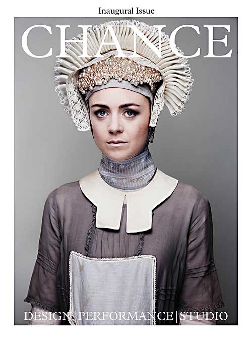
 And that in a nutshell is how Chance magazine—where this photo was published last May—wants to treat stage design. It all began casually the winter before last at an NYC sake bar. Sound designer Fitz Patton and set and costume designer Dane Laffrey were voicing a frustration shared by many in their field that production shots, often the only record of a show after it closes, rarely focus on sets, lighting, or costumes. “Design wasn’t really being photographed,” as Patton puts it, recalling that conversation. “It was being caught in passing.”
Next came the “what if” phase: Why not wrangle a few design-centric studio shoots and see what happened? It took four months to finagle the first two sessions, with costumed actors from Boeing Boeing and items from the Wicked wardrobe department, but Patton was hooked: “I felt like I was discovering design for the first time.”
A dozen or so shoots later, a cohort of some 20 collaborators—mostly working stage designers—had assembled, and a magazine was taking form. Enlisting alongside editor Patton were editorial director Sean Cunningham and design editors Laffrey, Camille Assaf, and Junghyun Georgia Lee. Taking their place with Petkov on the masthead were photographers T. Charles Erickson, Stephen Joseph, Carol Rosegg, Scott Suchman, and Fabrice Trombert (several of whose names will be familiar to readers of American Theatre). Drew Lichtenberg and Lee Savage became contributing editors and Jimin Hong and Hannah Yampolsky signed on as graphic designers. (Starting with the second issue, Barbara Eldredge of New York’s Museum of Modern Art has also joined the team, as have graphic designer and illustrator Jeff Hinchee, and Daniel Kluger, who will shape the magazine’s coverage of sound design.)
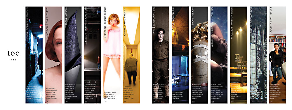
A key ally in bringing the text up to the level of the imagery, Patton says, has been dramaturg Martha Wade Steketee, who came on board as monograph editor and kicked things off with a lushly illustrated career overview of 20th-century designer Ben Edwards. Playwright Sharr White agreed to have a portion of his as-yet unstaged The Snow Geese (slated to debut this fall on Broadway) published in the inaugural issue alongside Trombert’s pictorial of actors costumed by Chance staffers as the characters in the play. The issue also goes backstage at Shakespeare Theatre Company of D.C.’s production of Strange Interlude and puts two of its designers, Tom Watson and Jane Greenwood, in conversation; an “Interview” section quotes Andrew Lieberman on his unusual set design for Roundabout Theatre Company’s Look Back in Anger.
Spread after spread, however, the photos get star billing, rarely marred by so much as a page number. Here, live theatre is not a subject for documentation—it is the raw material, the milieu, from which new creations are born. As scenic designer Savage put it in a promotional video for the first issue’s release: “One thing that inspired me about joining the magazine was this idea of squeezing more art out of the art.”
The final product weighs in excess of one and a half pounds and takes 28 days to travel by boat from its South Korean printing plant to U.S. customs, where it idles for another few days before it can be uncrated and sent to subscribers. Once you, the reader, finally have it in hand, you’ll need to clear some space on your lap or tabletop (not to be confused with your laptop or tablet) to comfortably read it. If you’d like to show one of the features to a friend, you might as well make a coffee date and bring it along. Isn’t this a stubbornly anachronistic venture? One might expect a sound designer, in particular, to be drawn instead to the dynamic possibilities of online publication.
Patton, however, claims a sort of “group hysteria” has led to premature eulogies for print periodicals. “The question is: What does a magazine have to become?” he suggests. “My thinking now is that it has to become an art book.
“The Internet is the Sargasso Sea for great photography,” he ruminates further. “It’s the place where images go to die. There’s never context or control over the color. The screens just aren’t good enough. Because of the nature of what the web is, everything is disposable. If it goes online, it’s like it just dissolves.” Print, on the other hand, “has the power to ground images in a kind of reality that can change you. Where the image flow has been carefully done, there’s a kind of power that comes from the way the images compound each other’s strength.”
Aesthetics aside: Wouldn’t taking to the web be more practical from a business standpoint? Perhaps so. But with the help of Kickstarter, Chance’s creators have raised enough money to get three issues off the ground. So far it has signed up just over 600 subscribers at $50 a pop (for which they will receive some 800 pages of content). The second issue, “The Box”—promised to subscribers late this month—will include a piece on Ming Cho Lee’s model boxes; commentary by Barneys creative director Simon Doonan on Barneys-style displays created by Savage in consultation with Lee and actor Pun Bandhu, exploring nontraditional casting through the use of garments from Helen Uffner Vintage Clothing in New York; and a conversation between star architect Charles Renfro and set designer Scott Pask.
The third issue, “Couture/Stage,” will center in France, where design editor and costumer Assaf is based, and will offer a behind-the-scenes shoot at the Comédie-Française and feature work from the Festival d’Avignon. A not-yet-funded fourth issue devoted to “community” is tentatively planned to delve into the design and atmosphere of shows at a Kansas high school and the West Bank’s Freedom Theatre, among others.
No ads have been sold for Chance’s first few issues. If the magazine can reach 2,000 subscribers by January 2014, its creators think they can continue to put it out ad-free. (Those wishing to join those ranks may visit www.chance-magazine.com.) Chance may not be positioned to sell in the grocery checkout line—but neither is its target readership limited to those working in stagecraft. There’s no reason that hoped-for 2,000 shouldn’t include a gallery owner, an interior decorator, a film geek, or a fashionista. “We’re hoping to unlock the potential for theatre and theatre design to become a point of connection with all of the arts,” Patton explains.
Lest any aspiring publishers rush off to duplicate Chance’s business model, be warned: Neither salaries nor stipends are in the budget. Editors, writers, designers, and photographers alike are contributing their talents for free, amid busy day jobs. To put it another way, their compensation comes in less tangible currency: the opportunity to participate in the project’s entrepreneurial spirit and to elevate two art forms, theatrical design and photography, they collectively hold dear. It’s hard to guess how long such an arrangement can be sustained. But in the meantime—oh!—isn’t Susan Hilferty’s green boot something to see?


