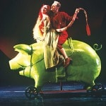
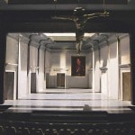
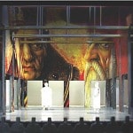
Rather than delving into the design of a single production, this month’s Production Notebook takes its cue from the issue’s theme—“The Designer’s Eye”—and expands to celebrate the artistry of one of the most important American designers of the 20th century, Ming Cho Lee. On the eve of TCG Books’ publication this month of Ming Cho Lee: A Life in Design, theatre historian Arnold Aronson’s richly detailed exploration of Lee’s unprecedented career, we bring you a sampler of the work Lee created for five flagship American companies.
Unlike many of the designers he trained and mentored, Lee didn’t make his mark on Broadway. Instead, it was through some 300 productions of theatre, opera and dance at venues across the country that he reshaped the aesthetics of American scenic design. Images for the book were chosen personally by Lee from thousands of photos, drawing, sketches, renderings and models, all carefully cataloged by Lee’s wife and lifelong archivist, Betsy. The following images and excerpts highlight Lee’s designs for five theatres where he worked extensively.
NEW YORK SHAKESPEARE FESTIVAL
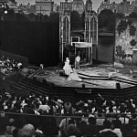
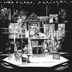
What was happening at Joseph Papp’s New York Shakespeare Festival would have a profound impact on American theatre, and it was at the Delacorte Theater in Central Park that American scenography was radically transformed by the work of Ming Cho Lee. There are slightly varying accounts of what led Papp to call Lee. Lee thinks that the company manager, Hilmar Sallee, may have recommended him. Lee had actually interviewed with Papp once before, but at that point he had no Shakespeare experience and very little in his portfolio that was relevant. Meanwhile, director Gerald Freedman believes that he urged Papp to see Lee. Based on the recommendation of his Northwestern University schoolmate Omar Paxson, Freedman had met with Lee several years earlier when he was looking for a designer for an Off-Broadway revival of On the Town. “It soon was apparent,” Freedman recalls, “that Ming wasn’t of that sensibility. But his portfolio was so outstanding, so gorgeous, I still talk about it, and I said, ‘We’re going to work together.’ I introduced him to Joe Papp, which then led to our long collaboration there.” Whatever the impetus for the call, Papp was obviously impressed by this second encounter. Lee remembers Papp ending the interview with, “All right, you sound pretty good. Go for it!”
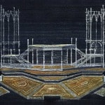
The boxes around the front of the stage hid the floor microphones, which were essential because of the theatre’s poor acoustics (and long before the age of body mikes).
There were also microphones hidden within the scenic units. “In designing for Shakespeare in the Park,” notes Lee, “the first thing you do is figure out where to put the microphones. It was all very primitive. All the staging was controlled by where you are in relation to the mikes.”
THE ARENA STAGE
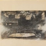
Lee first learned about Arena Stage through his former assistant Karl Eigsti, who was designing there, and the Washington, D.C. theatre intrigued him. But in 1967 Lee never anticipated that Arena would become a second home where he would ultimately design a total of 21 productions through 1998. Part of the appeal was the space itself. The theatre took its name from the stage configuration it used, a theatre-in-the-round, also known as an arena stage. Despite the name, Arena’s stage was not circular but rectangular, surrounded on four sides by steeply banked seating risers—founding artistic director Zelda Fichandler referred to it as a gladiator ring. Designing for the round imposes peculiar demands. It is not possible, for instance, to have standard walls because they block sightlines for some part of the audience; entrances are generally made through the vomitories, passageways to the stage from under the seats. The most important scenic element tends to be the floor. At the same time, the stage must be envisioned as a cube with the vertical space crucial for establishing the stage as a distinct locale within the auditorium. Lee was eager to take on such a challenge.
Lee seemed to have an instinctive feel for the space. “I have a real understanding of working in a theatre where the audience and performers are under one roof,” he observes. “I always thought in terms of floor and scenic elements and icons. When you approached things at Arena Stage with the greatest of simplicity, the play being in the middle of the audience, and you were not distracted by pictures, it could be so potent, you can’t imagine.”
THE MARK TAPER FORUM
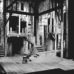
The Mark Taper Forum, opened in 1967, is a circular building in the midst of the rectangular campus of Los Angeles’s Music Center, which also houses the Ahmanson. The buildings were designed by architect Welton Becket, but the theatre itself was designed by Jo Mielziner, who had also designed the Vivian Beaumont Theater at Lincoln Center in New York. The stage is a thrust surrounded by a semicircular amphitheatre. The Taper’s founding artistic director, Gordon Davidson, says that as a director he has always been interested in the three-dimensionality of the thrust, in particular the intersection of stage and audience. “I never had to explain that to Ming,” he remarks. “He thrived on it. He was very sensitive to how the set lived within the larger place. It was one entity.”
ACTORS THEATRE OF LOUISVILLE
Former Actors Theatre of Louisville producing director Jon Jory had been familiar with Lee’s work for years. Nonetheless, he says it took a lot of nerve to call Lee, who he describes as the great American designer of the period. As always, Lee grilled the director about his ideas for the production. But Jory also describes Lee as a “remarkable dramaturg,” and the evolution of that production was, in the end, a truly collaborative process, perhaps more so than any experience either Lee or Jory had had until then. Their first conversation about the production lasted more than an hour during which time, according to Jory, they never discussed the design. It was about the play and the ideas inherent within it. “I was nervous,” Jory admits, “but he generously draws out your ideas and melds them with his own. Soon you begin to feel that you’re pretty intelligent.” Costume designer Marcia Dixcy, Jory’s wife, designed four of the six shows Lee and Jory did together. “Ming was a guiding force dramaturgically and visually on every production we worked on,” she says. “His insights into the text and in to how an audience may best perceive the text are deeply felt and vividly theatrical. Few set designers discuss character with his humanity and compassion.” “I consider myself one of Ming’s students,” Jory reflects, echoing what many of Lee’s collaborators have felt. “He disguised his classes as productions. I have no degree beyond high school, but I have a master’s degree from the University of Ming.”
SHAKESPEARE THEATRE COMPANY
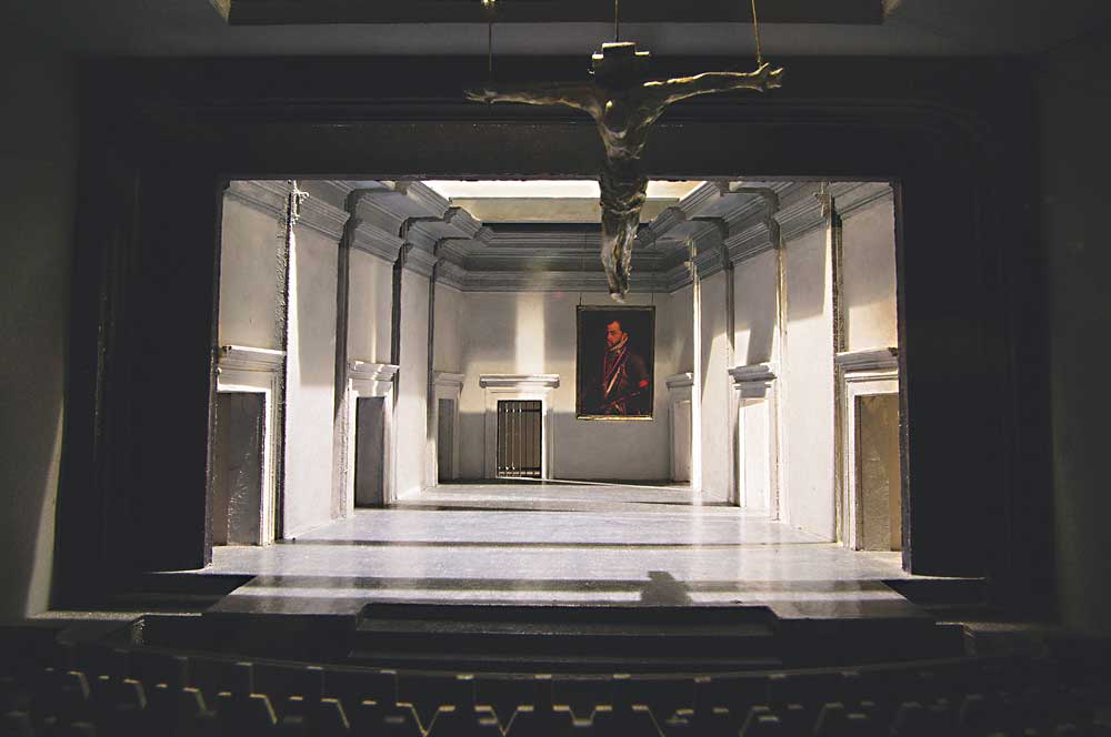
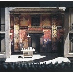
Under Michael Kahn’s direction, the Shakespeare Theatre Company in Washington, D.C. presented a repertoire of classics seldom produced in the American theatre, and among the plays Lee designed there were Mourning Becomes Electra, Peer Gynt, King John, Don Carlos and the almost unknown Lorenzaccio. The Shakespeare Theatre Company became Lee’s primary home for the remainder of his career, with six productions in the eight years before he retired. As Kahn points out, Lee’s great strength is his ability to shape space, and while his sets are rightly known for their verticality, there is usually something that cuts across the horizontal plane that restricts or transforms the space.

